Build the Viral Nostalgia Music Website With Claude Code
Build the viral nostalgia music website with Claude Code in about 20 minutes: one background poster, ten songs, one prompt, and a live link you can share.
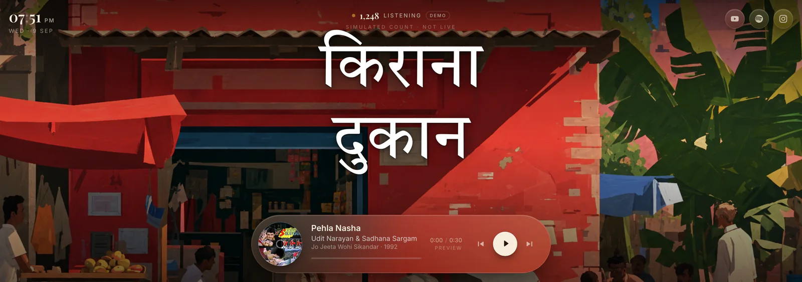
The nostalgia music website going viral on Instagram is a single web page: a painted street scene behind a glass music player, a spinning record, and a handful of songs that mean something to the person you send it to. You can build it with Claude Code in about twenty minutes using three ingredients — a background poster, a list of songs, and one long prompt — and you do not need to know how to code to finish it.
This is the complete walkthrough. Every step, every file, the exact prompt, and the five things that go wrong the first time so they do not have to go wrong for you.
What You Are Building
A nostalgia music website is a one-page site that plays a curated song list over a full-screen illustrated background, with a floating glass player fixed to the bottom of the screen. There is no home page, no menu and no sign-up. The whole point is that you open the link and the first song is one line of text away from a memory.

On a phone the same site is composed differently: a taller background image and a stacked player card with bigger controls, rather than the desktop pill squeezed down.

What it costs. Nothing, if you already have Claude Code. The backgrounds are AI-generated images, the song metadata and cover art come from Apple's free public catalogue API, and both Netlify and Vercel host a site this size on their free tier.
What You Need Before You Start
| Thing | Why |
|---|---|
| Claude Code | Writes the whole site. The desktop app or the terminal CLI both work. |
| Node.js 20 or newer | Next.js 16 will not install on anything older. Check with node -v. |
| Two background images | One landscape, one portrait. Covered in Step 1. |
| A list of ten songs | Song name and film or album. Covered in Step 2. |
| About twenty minutes | Most of it is waiting while Claude Code writes files. |
Step 1 — Get Your Background Poster
The background carries the whole mood of the site, so this is the one step worth spending real time on. You need two images, not one.
A landscape image for computers
Roughly 16:9. This is what anyone opening the link on a laptop will see.
A portrait image for phones
Roughly 9:16, and composed separately — not the landscape one cropped. A crop cuts the subject in half and leaves nothing above it for the title.
Two ways to get them. The quicker one: download a ready-made pair from this Drive folder, which has several scenes already made in matching landscape and portrait versions.
The more personal one: generate your own with ChatGPT, Gemini or Midjourney. Describe a place that means something to the person you are making this for. Ask for the same scene twice, once wide and once tall, in one conversation so the style stays consistent.
A painted illustration of an Indian street corner in the late afternoon: a bright red kirana shop with a corrugated tin awning, crates of mangoes, men sitting on stools talking, palm trees and pink concrete houses behind, deep blue sky. Flat gouache painting style, warm sunlight, rich saturated colour, no text anywhere in the image. Landscape 16:9, leave the upper third relatively open.
Ask for no text in the image. The site puts its own title on top in real HTML text, which stays sharp on every screen. If the image already has words baked into it you end up with two titles fighting each other.
Step 2 — Write Your Song List
Ten songs is the right number. Enough to feel like a mixtape, few enough that every one of them earns its place. For each song you need the song name and the film or album it came from — that is all Claude Code needs to find everything else.
Here is the list used in the original site, if you want to start from a known-good one:

| # | Song | Film | Year |
|---|---|---|---|
| 01 | Pehla Nasha | Jo Jeeta Wohi Sikandar | 1992 |
| 02 | Dheere Dheere Se Meri Zindagi Mein Aana | Aashiqui | 1990 |
| 03 | Tujhe Dekha To | Dilwale Dulhania Le Jayenge | 1995 |
| 04 | Ek Ladki Ko Dekha | 1942: A Love Story | 1994 |
| 05 | Chura Ke Dil Mera | Main Khiladi Tu Anari | 1994 |
| 06 | Tu Hi Re | Bombay | 1995 |
| 07 | Dil To Pagal Hai | Dil To Pagal Hai | 1997 |
| 08 | Chaiyya Chaiyya | Dil Se.. | 1998 |
| 09 | Kuch Kuch Hota Hai | Kuch Kuch Hota Hai | 1998 |
| 10 | Pehla Pehla Pyar Hai | Hum Aapke Hain Koun..! | 1994 |
Swap in your own freely. The list is the part that makes the site a gift rather than a demo, and it does not have to be Bollywood — any decade, any language, any genre works the same way.
Step 3 — Put the Two Images Where Claude Code Can See Them
This is the step that trips up almost everyone, so it gets its own section. Pasting an image into a chat is not the same as giving Claude Code a file. An attachment is something the model can look at; it is not something on your disk that a website can load. If you only paste the images, you will get a finished site with an empty background.
So save both images into a folder called public/bg inside your project folder, using Finder or File Explorer:

Name the files so the names say what they are — shop_desktop.png and shop_mobile.png, or scene-wide.png and scene-tall.png. Claude Code reads which is which straight off the filename, so you never have to explain it.
If your project folder does not exist yet, make an empty one first and point Claude Code at it. In the Claude Code terminal:
mkdir -p ~/Desktop/nostalgia-site/public/bg
cd ~/Desktop/nostalgia-site
Step 4 — Give Claude Code the Prompt
This is the whole build, in one message. It is long on purpose: every line of it is a decision you would otherwise have to make later by asking for changes. Paste it into Claude Code, change the two marked lines, and press Enter.
Change these two things before sending: the Title line near the bottom, and the song list. Everything else can stay exactly as it is.
Build me a single-page nostalgia music site in Next.js.

## Stack
- Next.js, App Router, TypeScript, `app/` at the project root (no `src/`).
- Tailwind CSS v4 using `@theme` tokens in `app/globals.css` (no tailwind.config).
- Dependencies: next, react, react-dom, @vercel/analytics, @vercel/speed-insights.
- No CSS-in-JS, no component library, no state manager.

## Assets and song list
- Two background images are already in `public/bg/`. Their filenames say which is
  for desktop and which is for mobile. Use the desktop one for landscape and the
  mobile one for portrait, and reference their actual filenames in the code — do
  not require me to rename them.
- The mobile image is separately composed; do not create it by cropping the
  desktop one.
- Use the song list below as the playlist. Fetch matching song metadata and cover
  artwork, and use permitted playable audio sources or official embeds. Do not
  invent audio URLs or treat a YouTube page URL as an audio file. If a song needs
  an audio file you cannot access, tell me clearly what to provide.

Songs:
1. Pehla Nasha — Jo Jeeta Wohi Sikandar (1992)
2. Dheere Dheere Se Meri Zindagi Mein Aana — Aashiqui (1990)
3. Tujhe Dekha To — Dilwale Dulhania Le Jayenge (1995)
4. Ek Ladki Ko Dekha — 1942: A Love Story (1994)
5. Chura Ke Dil Mera — Main Khiladi Tu Anari (1994)
6. Tu Hi Re — Bombay (1995)
7. Dil To Pagal Hai — Dil To Pagal Hai (1997)
8. Chaiyya Chaiyya — Dil Se.. (1998)
9. Kuch Kuch Hota Hai — Kuch Kuch Hota Hai (1998)
10. Pehla Pehla Pyar Hai — Hum Aapke Hain Koun..! (1994)

## Page layout — app/page.tsx (server component)
`<main>` is `relative isolate flex min-h-dvh flex-1 flex-col items-center
justify-between overflow-hidden`, containing:

1. Fixed background div, `-z-20`, class `hero-bg`, `bg-cover bg-center`. In CSS,
   use the desktop background and switch to the mobile background inside
   `@media (orientation: portrait)`. Overlay a
   `bg-gradient-to-b from-black/35 via-black/10 to-black/60`.
2. Fixed grain overlay, `-z-10`: an inline SVG `feTurbulence` data-URI,
   `mix-blend-soft-light`, low opacity, `pointer-events-none`.
3. Fixed top row: clock top-left, listener count top-centre, social links
   top-right. If no live listener data is available, label the count as a demo.
4. Title overlay, centred in the upper portion of the screen.
5. The player, bottom-anchored, `max-w-xl`.

All fixed elements must respect safe-area spacing using
`max(1rem, env(safe-area-inset-top))` and the matching right, bottom and left
values. The viewport export must set `viewportFit: "cover"`.

Keep `app/page.tsx` a server component. Put the interactive clock and player in
client components.

## Title overlay

Title: [Kirayana Shop]

- Convert the title above into natural Hindi written in Devanagari and display
  only the Hindi version. "Kirayana shop" becomes "किराना दुकान". If it is
  entered in Roman Hindi, transliterate it: "Apni Ambassador" becomes
  "अपनी एम्बेसडर".
- If the background image already contains the same title, do not add it again.
- Large, elegant white Devanagari lettering with a classic Hindi cinema-poster
  feel. Use a high-contrast serif Devanagari font such as "Tiro Devanagari
  Hindi", loaded through `next/font/google`.
- Add a subtle dark text shadow for readability. No text box, coloured
  background, heavy outline or badge.
- Centre it horizontally in the upper portion of the screen, above the main
  subject, and split it into two balanced lines where appropriate.
- Keep line-height around 1.05–1.15 so the vowel marks stay fully visible.
- Desktop: about `clamp(64px, 8vw, 140px)`, positioned 10–15% from the top,
  below the clock and social links.
- Mobile: about `clamp(40px, 12vw, 72px)`, with safe horizontal margins, placed
  below the top row and clear of both the main subject and the player.

## The player — this is the centrepiece
A floating glass pill on desktop, a stacked card on mobile. Two separate blocks
(`hidden sm:flex` / `sm:hidden`), not one reflowing layout. Both must share the
same playback state and audio source, so switching layouts does not restart or
duplicate playback.

Glass recipe (a flat white/10 fill reads as a grey slab, not glass):
  border border-white/10
  bg-gradient-to-b from-white/[0.15] to-white/[0.055]
  backdrop-blur-3xl backdrop-saturate-[1.7]
  shadow-[0_16px_48px_-12px_rgba(0,0,0,0.8),inset_0_1px_0_rgba(255,255,255,0.2)]

DESKTOP — one horizontal pill, `rounded-full p-3 pr-5`, left to right:
- A spinning vinyl: the cover art in a circle, 80px, `animation: spin 8s linear
  infinite`, with `animationPlayState` set to `running`/`paused` from playback
  state. Absolutely centre a 12px `bg-black/70 ring-2 ring-white/40` circle on
  top as the spindle hole.
- Title (15px semibold) and artist (12.5px white/70), both `truncate`.
- A seek bar under them: 24px invisible hit area, 3px visible rail
  `bg-white/15`, fill in the accent colour with a soft glow, knob on hover only.
- Elapsed / duration in 10.5px tabular-nums.
- Transport on the right: prev, play/pause, next.

MOBILE — a stacked glass card, `rounded-3xl p-4`, bottom-anchored:
- `sm:hidden`, full available width with safe-area-aware side margins, same
  glass recipe as desktop.
- Top row: a 64px spinning vinyl on the left, title and artist stacked on the
  right, same spin behaviour and spindle-hole detail as desktop.
- Title 15px semibold, artist 12.5px white/70, both `truncate`, and the text
  container must use `min-w-0`.
- Below that: a full-width seek bar with a 24px touch area, 3px visible rail,
  accent-colour progress and an always-visible knob.
- Below that: elapsed time left, total duration right, 10.5px tabular-nums.
- Bottom row: centred previous, play/pause and next, every button at least a
  44px touch target, with a larger circular play/pause button.
- Keep spacing compact, stay above the bottom safe area, and prevent horizontal
  overflow.
What Claude Code does with it
It installs Next.js and Tailwind, writes about fifteen files, and starts a local server. Then it looks up every song. The song metadata, the album name, the real track length and the cover art on the spinning record all come from Apple's public iTunes Search API, which is free and needs no key:
https://itunes.apple.com/search?term=pehla+nasha+jo+jeeta+wohi+sikandar&entity=song&limit=25&country=IN
When it finishes it will print a local address, usually http://localhost:3000. Open it. That is your site.
What That Prompt Actually Says
That prompt is long, and if you have never built a website before it reads like a wall of jargon. It is not. It is six decisions, written down so you never have to argue about them later. Here is what each block is telling Claude Code — and what the words mean.
You do not need to memorise any of this to finish the build. Read it once and the prompt stops being magic, which means you can start changing it on purpose.
1. The stack — what the site is made of
The first block names your tools. An AI agent left to choose its own will pick something different every time, and you cannot learn from a project that is built differently on every run.
| The line | What it means |
|---|---|
Next.js, App Router | Next.js is the framework that turns React code into an actual website. The App Router is its newer file-based routing system: a folder becomes a web address, and a file called page.tsx becomes the page at that address. |
TypeScript | JavaScript with type checking. It catches a misspelled variable when you build rather than when a visitor clicks something. |
app/ at the project root (no src/) | Purely about where files live. Some projects nest everything inside src/. Picking one shape means the agent does not mix both conventions halfway through. |
Tailwind CSS v4 | Styling written as class names in the markup — rounded-full p-3 — instead of a separate stylesheet. Version 4 needs no tailwind.config file. |
@theme tokens in app/globals.css | Your design variables: the accent colour, the fonts, the spin animation. One place to change the look of the whole site. |
No CSS-in-JS, no component library, no state manager | The most useful line in the prompt. Without it, an agent reaches for a UI kit and a state library, and you inherit forty packages you cannot read. Naming what not to use keeps the project small enough to understand. |
2. The assets block — how you hand an agent real material
This block is about the difference between showing and giving. An image pasted into a chat is something the model can look at. A file in public/bg is something a website can load. Only the second one ends up on your page.
Two lines here are guardrails rather than instructions:
"Reference their actual filenames — do not require me to rename them"
Left alone, an agent invents tidy names like scene-wide.png and then writes code expecting them, so your real files silently do nothing. This line makes it adapt to you instead.
"Do not invent audio URLs or treat a YouTube page URL as an audio file"
A language model will happily produce a web address that looks exactly right and does not exist. Naming the specific failure in advance is the single most effective prompting habit there is. The follow-up — "tell me clearly what to provide" — turns a gap into a report instead of a fake.
3. The layout block — how the screen is stacked
A web page is layers. This block says what sits at which depth, and what stays put when you scroll.
| The line | What it means |
|---|---|
min-h-dvh | At least one full screen tall. The dvh unit is the dynamic viewport height, which accounts for a phone browser's address bar sliding away — the older vh unit does not, which is why full-screen pages used to jump on mobile. |
flex flex-col items-center justify-between | Stack children in a vertical column, centre them across, and push the first to the top and the last to the bottom. That is what pins the player to the bottom of the screen. |
relative isolate | isolate creates a fresh depth context, so the layers sent behind the content stay behind this box and cannot slide underneath the rest of the page. |
-z-20 and -z-10 | Depth order. The background sits at the very back, the grain texture just above it, and everything else on top. |
fixed | Pinned to the screen rather than the document, so it does not move. |
bg-cover bg-center | Scale the image until it fills the area, crop whatever overflows, keep the middle. This is why a wide image on a tall screen loses its sides — and why the prompt asks for two separately composed images. |
@media (orientation: portrait) | The actual switch between your two backgrounds. It asks the screen whether it is taller than it is wide, which is more reliable than guessing from width. |
feTurbulence data-URI | A film-grain texture generated by an SVG noise filter written directly into the CSS, so it costs no image file and no extra download. mix-blend-soft-light blends it into the art instead of greying it out, and pointer-events-none stops the layer swallowing your clicks. |
max(1rem, env(safe-area-inset-top)) | env(safe-area-inset-*) is how much of the screen is hidden under a notch, a rounded corner or a home bar. max() means "at least 16px, more where the phone needs it". Without it, your clock ends up under the camera cutout. |
viewportFit: "cover" | The switch that lets the page use the entire screen including under the notch. The safe-area values above only do anything once this is set. |
server component / client component | A server component is rendered once on the server and ships no JavaScript to the browser — fast, but it cannot respond to clicks. Anything with a ticking clock or a play button has to be a client component. Splitting them is why this page loads instantly and still has a working player. |
4. The title block — type that stays sharp
The title is real HTML text sitting on top of the picture, not lettering baked into the image. That is what keeps it crisp on a retina screen, translatable, and selectable.
| The line | What it means |
|---|---|
next/font/google | Downloads the font at build time and serves it from your own site. No request to Google when a visitor arrives, and no flash of the wrong font while it loads. |
Tiro Devanagari Hindi | A high-contrast serif face for Devanagari script. Naming a specific font matters — a generic request gets you a default sans-serif that looks nothing like a film poster. |
clamp(64px, 8vw, 140px) | Fluid type in one line: never smaller than 64px, never larger than 140px, and 8% of the screen width in between. vw means viewport width, so the title grows with the window instead of jumping at fixed breakpoints. |
line-height 1.05–1.15 | Devanagari carries marks above and below the letters. Squeeze the lines tighter than this and the vowel signs collide or get clipped — a detail Latin-only defaults get wrong. |
subtle dark text shadow, no badge | A soft shadow keeps white letters readable over a bright wall while leaving the artwork visible. A solid box behind the text would be easier and would look like a caption, not a poster. |
5. The glass recipe — why it is so specific
The prompt spells out four separate properties for the player's surface, and it says why in a parenthesis: a flat white/10 fill reads as a grey slab, not glass. Real glass does four things at once, and skipping any one of them is what makes most attempts look like grey plastic.
| The property | What it does |
|---|---|
backdrop-blur-3xl | Blurs whatever is behind the panel, so the street scene shows through as colour rather than detail. |
backdrop-saturate-[1.7] | Pushes the colour behind it up by 70%. This is the one people skip, and it is what sells the illusion — real glass concentrates the colour passing through it. |
bg-gradient-to-b from-white/[0.15] to-white/[0.055] | Light falls off down the panel instead of being uniform, the way a real pane catches more light at the top. |
inset 0 1px 0 rgba(255,255,255,0.2) | A one-pixel highlight along the inside of the top edge — the lit rim of a piece of glass. Tiny, and the difference between a panel and a shape. |
shadow 0 16px 48px -12px | A large, soft, offset shadow that lifts the player off the background so it reads as floating. |
6. The player block — two layouts, one brain
The last and longest block describes the player twice, once for desktop and once for phones. That is deliberate, and it is the most transferable idea in the whole prompt.
Most sites are built as one layout that squashes down as the screen narrows. This one asks for two separate blocks — hidden sm:flex shows the desktop pill only from 640px up, sm:hidden shows the phone card only below it. A horizontal pill and a stacked card want genuinely different structures, and forcing one to become the other is where responsive layouts turn ugly.
The catch is that two layouts must not mean two players. The line "both must share the same playback state and audio source, so switching layouts does not restart or duplicate playback" is what prevents the song restarting when you rotate your phone, or two copies playing at once.
| The detail | Why it is in the prompt |
|---|---|
animationPlayState: running / paused | The record's spin is a CSS animation. Rather than starting and stopping it, the code pauses it in place, so the label picks up where it left off. |
truncate and min-w-0 | Dheere Dheere Se Meri Zindagi Mein Aana is longer than any player. truncate ends it with an ellipsis; min-w-0 is the piece everyone forgets, without which the text refuses to shrink and stretches the card off the screen. |
24px invisible hit area, 3px visible rail | The seek bar looks like a hairline and behaves like a 24-pixel target. Thin to look at, easy to hit. |
tabular-nums | Forces every digit to the same width, so the timer does not shuffle sideways as the seconds tick. |
at least a 44px touch target | Apple's long-standing minimum for anything a finger has to hit. Smaller controls look tidier in a screenshot and are annoying in a hand. |
| knob on hover / always visible | A mouse can hover, a finger cannot. So the desktop knob appears on hover and the phone one is simply always there. |
The pattern worth stealing. Every block above does the same three things: it names the tool, it states the constraint, and it explains the reason in a short parenthesis. The reasons are what make a long prompt work — an agent that knows a flat fill reads as a grey slab will not hand you a grey slab, and an agent that knows why you want two layouts will not merge them to be helpful.
The Five Things That Go Wrong The First Time
None of these are your mistake. They are what this particular build does, every time, and each one takes a minute to fix once you know it is coming.
The background is a plain gradient
Your images are not in public/bg as real files — you pasted them into the chat instead. Save them into the folder, then say "the images are in public/bg now, point the CSS at them". This is the single most common failure.
You can see the player but hear nothing
There is no free, legal source of full-length film songs, so the player uses Apple's 30-second preview streams — real audio, but half a minute per song. To play full tracks you have to supply the audio files yourself and point each song at its own file. Ask for a small label like PREVIEW in the player so the difference is visible rather than confusing.
The clock and title vanish into the artwork
A bright background — a red wall, a white sky — swallows white text. Ask for "a dark scrim behind the top row" and a stronger text shadow on the title. Judge this only after your real images are in place; it never shows up against a placeholder.
The song duration is wrong until you press play
The player shows the full track length, then jumps to 0:30 when the preview loads. It is a real bug with a one-line fix: the page reads the audio length when the page loads, and the browser can finish loading it before the player is listening. Say "read the audio duration on mount as well as on the loadedmetadata event".
The page feels slow to open
AI image tools hand you 2 MB PNGs, and background images like these skip Next.js's image optimiser entirely. Ask Claude Code to convert both to WebP — it typically cuts them by around 80% with no visible difference.
Making It Yours
Four changes cover almost everything people want, and each is one sentence to Claude Code.
| What to change | What to say |
|---|---|
| The title | "Change the title to Apni Ambassador" — it transliterates into Devanagari for you. For any other language, say which script you want. |
| The accent colour | "Make the accent colour a deep rose instead of gold." It is one token in app/globals.css. |
| The songs | "Replace the playlist with these ten songs" and paste the new list. It re-fetches the artwork automatically. |
| A dedication | "Add a line under the title that reads for Aanya, always, in small italic white text." |
Five Ways To Actually Use This
1. As the project on your resume
This is a stronger portfolio piece than a to-do app, because it is a real product with real constraints: responsive art direction, an audio player with shared state across two layouts, a third-party catalogue API, accessibility on the seek bar, and safe-area handling on notched phones. Put the live link on your resume, not a screenshot. In an interview you can talk about the licensing decision — why the player uses 30-second previews and labels them — which is the kind of judgement call interviewers remember.
2. As a birthday gift
Ten songs from the year they turned sixteen, a background of the city they grew up in, and their name in the title. Send the link at midnight. It costs nothing and it is unmistakably made rather than bought.
3. As an anniversary page
The songs from the years you have been together, in order, with the title set to the place you met. Add a dedication line under the title with the date. This is the version people screenshot and keep.
4. For your girlfriend or boyfriend
Keep it to five or six songs rather than ten — the ones that are actually yours. The background matters more than the count here: the street where you first walked together beats a generic sunset every time.
5. As a shareable thing for a group of friends
One page per trip or per hostel year, with the songs everyone played to death. Send it into the group chat and watch it turn into an argument about song number four.
The finished source is public. The complete project from this guide is on GitHub at ritu-dadhwal4/nostalgia-music-website — every file Claude Code wrote, plus the two helper scripts that link the backgrounds and refresh the playlist. Read it alongside the prompt above to see how each instruction turned into code, or clone it and swap in your own poster and songs.
Putting It Online
Right now the site only exists on your computer — a local address like http://localhost:3000 works for you and nobody else. To get a link you can send, deploy it. Both of these are free for a site this size:
Deploy this to Netlify and give me the live URL. Walk me through any login step I need to do myself.
Netlify is the simpler of the two if you have never deployed anything. Vercel is the better fit if you kept the @vercel/analytics and @vercel/speed-insights packages from the prompt, because they start reporting visits with no extra setup. Either way you will have to sign in yourself — Claude Code will stop and tell you when.
Before you send the link. Open it on your own phone first. The portrait background and the stacked player card are a completely separate layout from the desktop one, and the phone is where most people will open your link.
Frequently Asked Questions
Do I need to know how to code to build this?
No. Every step in this guide is either saving a file into a folder or pasting text into Claude Code. You will read some code as it scrolls past, and you can ignore all of it. What you do need is the willingness to say "that is not right, fix it" two or three times.
Is the music legal to use?
The 30-second previews from Apple's catalogue API are meant to be played this way, and the cover art is served from Apple's own image CDN. Uploading full-length copies of film songs to your own hosting is not legal, which is exactly why the default build uses previews and labels them.
Can I use full songs instead of previews?
Yes, if the audio is yours to use — your own recordings, licensed tracks, or anything you have the rights to. Put the files in a public/audio folder and tell Claude Code to point each song at its file instead of the preview URL.
Why does it need two background images instead of one?
Because a phone screen is a completely different shape from a laptop screen. Scaling one wide image to fit a tall screen either squashes it or crops the subject out of frame. Two separately composed images means the shop front is centred on both.
Can the title be in a language other than Hindi?
Yes. The prompt asks for Devanagari because that suits the 90s Bollywood theme, but say "put the title in Tamil script" or "keep the title in English with a serif display font" and it will. Ask for the matching Google font by name so the letterforms are right.
How long does this actually take?
About twenty minutes if your two images are ready before you start. Generating background images you are happy with is what takes the real time, and it is the part worth not rushing.
public/bg as real files. Pasting them into the chat is not the same thing, and it is the number one reason people end up with an empty background.Build one this week for someone whose birthday is coming. Ten songs, one street corner, one link — and something they will keep long after the messages have scrolled away.